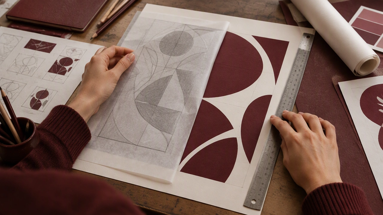
I am developing a poster for a small neighborhood music night and have three rough sketches, but none feels settled. The strongest idea uses a large cropped photograph, a compact title block, and a narrow information strip along the bottom. My main struggle is hierarchy: the date and venue need to be easy to find, yet I do not want the layout to become a stack of boxes. I have tried moving the title lower, increasing the contrast of the date, and reducing the number of type sizes, but each change seems to weaken another part of the composition. I would appreciate feedback on where your eye lands first, whether the photograph supports the event mood, and which areas feel under-resolved. Suggestions for tightening the grid or simplifying the visual structure are especially welcome. I can share the current file and the original sketches if that makes the critique more useful.