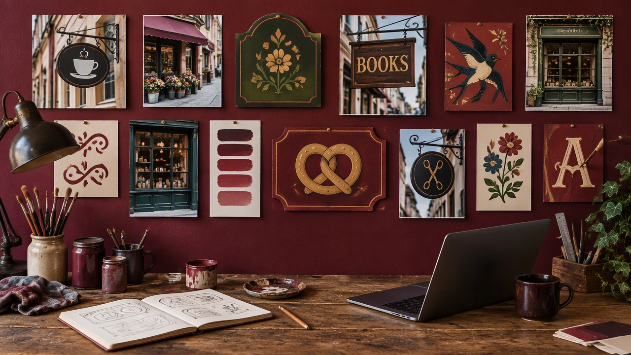
I have been collecting references of signs, labels, and hand-painted lettering from markets, workshops, transit platforms, and small shops. What interests me is not only the letterforms but the way information is negotiated through limited space, uneven surfaces, and quick decisions. Some examples use bright color to create instant recognition, while others rely on repetition, framing, or a strong directional arrow. I am saving photographs of temporary notices as well as carefully maintained shop fronts because both show how people make meaning with the tools available. If you have references from your own city or from books, websites, and archives, please share them with a short note on what makes the example useful. I am particularly drawn to examples where imperfection adds clarity rather than confusion. This thread can become a practical moodboard for identity work, editorial design, wayfinding studies, and projects that need a human touch.