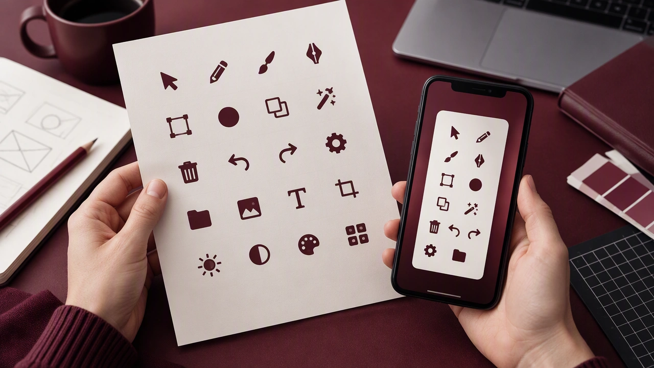
I have drawn a set of twelve interface icons for a creative tools app and I am unsure whether the level of detail survives at small sizes. The icons use rounded corners, a consistent two-pixel stroke, and small interior marks to suggest texture. They look clear on a large artboard, but when placed in a compact toolbar some of the inner shapes become visual noise. I have tried removing secondary details, enlarging the counters, and aligning every stroke to a simple grid, yet the set begins to lose character. I would appreciate feedback on which icons feel weakest at 16 and 20 pixels, where the stroke rhythm breaks, and whether the style is consistent enough for repeated use. Please also note if any metaphor is difficult to read without a label. I can provide the set on a light and dark background for comparison.