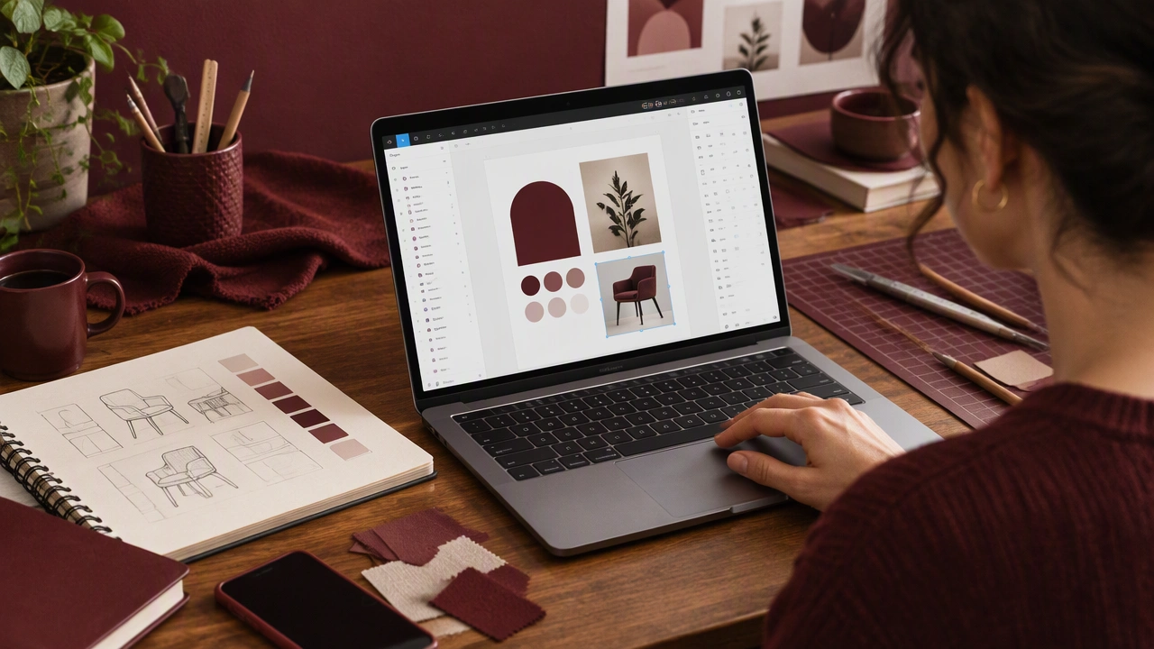
A Gentle Introduction to Figma for Hands-On Makers
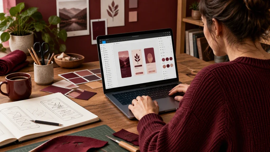
If you think with a pencil, Figma can feel strangely abstract. You cannot turn the screen, smudge an edge, or peel a layer off the table. Yet the same habits that make you good at sketching and physical prototyping translate naturally into this design tool. This introduction to creative skills and design practice treats Figma as another workbench: a place to arrange, test, and revise ideas without losing the tactile thinking that got them started.
For anyone exploring how to learn Figma for beginners who love sketching, the goal is not to abandon paper. It is to build a calm bridge from the page to the screen, one small step at a time.
Think of the canvas as a sheet of paper
Open Figma and you will see a large, pale canvas. It behaves like an endless sheet that can hold many pages at once. Instead of zooming into every detail immediately, place your first frame near the center. A frame is simply a bounded page, similar to a sketchbook rectangle. Frames can represent a phone screen, a poster, a card, or any fixed format you want to design.
Start by making two or three frames of the same size. Put them side by side. This is the screen equivalent of drawing several thumbnail ideas in a row. The space between frames is your working margin: useful for notes, scraps, and comparisons.
Keep the view comfortable. Zoom until the whole frame is visible, then leave enough room around it to breathe. Figma rewards patient observation more than rapid clicking.
Use shapes the way you use pencil marks
The rectangle, ellipse, line, and arrow tools are the digital version of basic strokes. Begin with loose blocks rather than polished components. Draw a rectangle for an image, a smaller one for a heading, and a thin bar for supporting text. This is wireframing: a rough arrangement that shows structure before style.
Do not worry about perfect alignment at first. Move shapes around with your mouse or trackpad, duplicate them, and try different arrangements. Duplication is especially useful. Rather than drawing the same element repeatedly, copy it and adjust the copy, just as you might trace a shape onto another sheet.
When you want a cleaner result, use the alignment controls. Select two or more objects and align their edges or distribute the space between them. Think of these tools as a ruler and set square, not as a strict authority.
Layers are like a stack of acetate
Every object lives in the Layers panel on the left. Newcomers often find this list confusing, but makers recognize it immediately: it is a stack of transparent sheets. The top layer sits above the others; the bottom layer sits behind them.
Select an object on the canvas and watch its name appear in the list. Rename important layers so you can find them later. Group related pieces together when they belong to one unit, such as a button or a small card. Grouping lets you move the whole unit without disturbing its parts.
If something disappears, check the layer order before panicking. You may have placed it behind a solid rectangle. This small habit prevents most early frustrations.
Type is material, not decoration
Text in Figma behaves like a strip of material that can be stretched, stacked, and repositioned. Choose a text box size that gives your words room, then adjust the type size and line spacing until the block feels balanced.
Use strong contrast between headings and body copy. A heading should feel like a bold label; body text should read calmly. Avoid too many type sizes. Two or three sizes usually create a clearer rhythm than a collection of nearly identical choices.
Read your text out loud while you place it. If a line becomes awkward or too narrow, widen the box or rewrite the sentence. Digital type is editable, so treat revision as part of the making process.
Color and style should follow the object
Begin with a restrained palette. Choose one background, one primary text color, one accent, and one or two supporting tones. Apply color as if you were selecting paper stock or paint. Each color should have a job.
Use fills for solid surfaces and strokes for outlines. Keep corners consistent across similar objects. If a button has rounded corners, decide whether cards and images should echo that softness or contrast with it. Consistency makes the screen feel considered without making it sterile.
Save repeated choices as styles when you are ready. A color style is like mixing a batch of paint once and reusing it. It keeps later changes manageable.
Build a simple prototype from your sketches
Once your frames have enough content, connect them into a small flow. Figma’s prototyping mode lets you draw a link from one object to another frame. A visitor can click a button and move to the next screen, much like turning a page in a paper storyboard.
Start with three moments: an entry screen, a decision point, and a result. Test the flow yourself first. Ask simple questions: Where does the eye go? Is the next action obvious? Does the sequence feel natural when you move through it quickly?
Prototype links are not a substitute for thoughtful structure. They are a way to experience timing and sequence before anything is built.
A calm practice for tactile thinkers
Use a repeatable routine. Sketch on paper first. Photograph or scan the strongest ideas. Build a rough frame in Figma using rectangles and text. Compare the screen version with the original sketch, then adjust the parts that lost their character. Add color and detail only after the structure feels right.
Work in short sessions. Make one meaningful change, save your file, and step away. Fresh eyes reveal spacing problems and unclear hierarchy faster than another round of tiny edits.
Keep a small library of your own examples. Save a button, a card, a simple navigation bar, and a favorite color set. Reusing your own decisions makes the tool feel familiar and keeps your attention on the idea rather than the interface.
Keep the hand in the process
Figma does not ask you to become a different kind of maker. It gives your sketches a place to be rearranged, shared, and tested. The best results come from moving back and forth: pencil to screen, screen to pencil, rough to refined.
Be patient with the interface and generous with your first attempts. Learn the canvas, shapes, layers, type, color, and prototype connections as separate skills. Together they form a practical studio practice for hands-on creators who want their digital work to feel as considered as the things they make by hand.