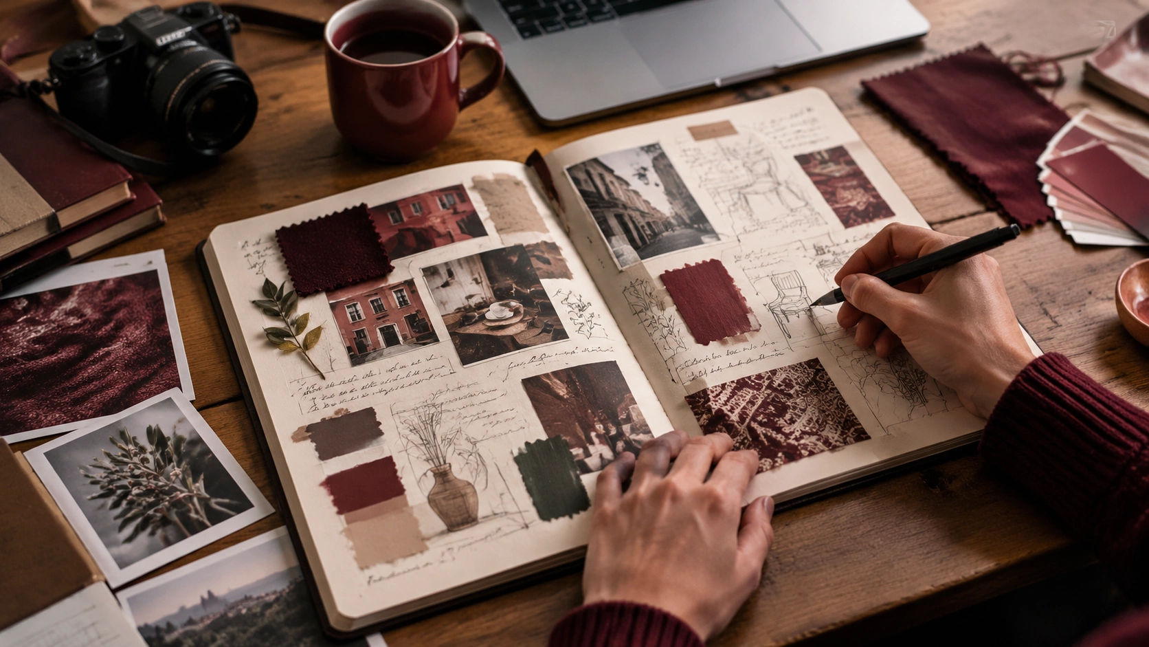
How to Keep a Visual Research Journal for Design Projects
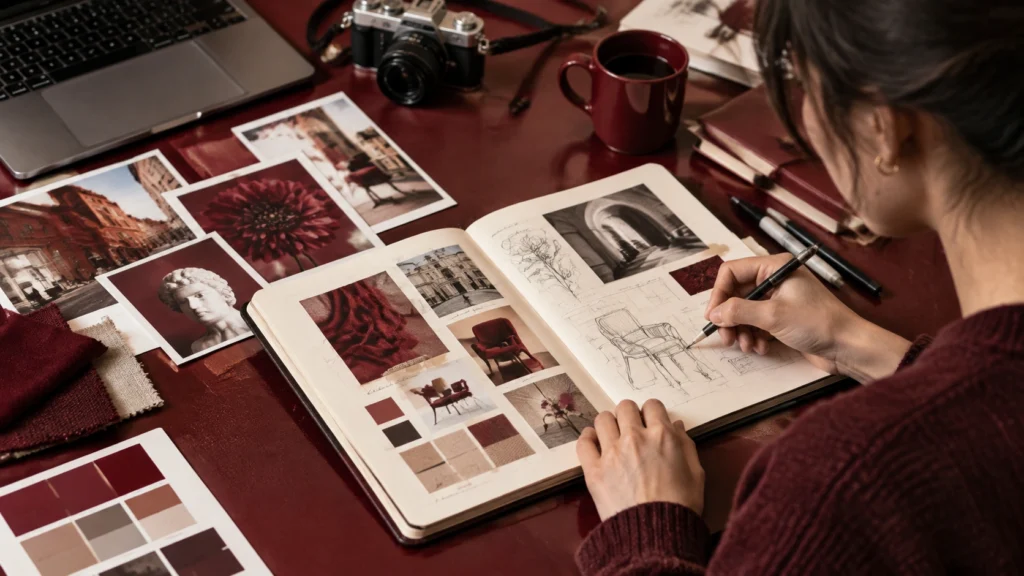
A visual research journal is a working record of what you notice, gather, and question while developing a design project. It sits between a mood board and a lab notebook: part archive, part thinking space, part evidence. For creative skills that depend on judgment, such a journal makes your references visible and gives you a place to test how they relate. Learning how to keep a visual research journal for design projects is less about making a beautiful scrapbook and more about building a reliable method for seeing.
Start with a purpose, not a blank page
Before collecting anything, write a short brief at the front of the journal. State the project, the audience, the constraints, and the questions you are trying to answer. A useful entry might be as simple as: What makes this packaging feel trustworthy without looking clinical? This sentence gives every later image a job. It also prevents the common trap of gathering attractive material that has no connection to the work.
Decide on a format you will actually use. A small notebook encourages daily notes; a larger sketchbook supports layouts and material samples; a digital folder works well for screenshots and PDFs. You can combine formats, but choose one primary home so the journal remains findable. If it is physical, number the pages. If it is digital, create a consistent folder structure and file naming rule. The aim is continuity, not perfection.
Collect with filters
Collection is easier when you know what qualifies. Set two or three filters before you begin. For example: images that show a specific color relationship, samples that demonstrate a texture, or references that solve a particular usability problem. Filters turn browsing into research.
Use a mix of sources
Strong journals combine different kinds of evidence:
- Direct observation: photographs of places, products, signage, packaging, or interfaces you encounter in daily life.
- Material samples: paper, fabric, paint chips, thread, wood veneer, or printed tests that can be touched and compared.
- Screen references: screenshots of websites, apps, typography, diagrams, or digital artwork, saved with the source noted.
- Made experiments: your own sketches, collages, color tests, and rough prototypes, including the versions that failed.
Keep the original context when you can. A cropped screenshot can hide the scale of a layout; a photograph without a date loses its place in time. Add the source, date, and a one-line reason for saving each item. This small habit makes later selection much faster.
Arrange for comparison
Arrangement is where a collection becomes research. Do not simply paste items in the order you found them. Group them by an idea: quiet surfaces, high-contrast type, handmade edges, or ways of guiding the eye. When a group feels crowded, split it. When two groups seem unrelated, place them side by side and ask whether a connection exists.
Build simple visual systems
Use a repeatable structure across pages. A practical page might include a large anchor image, two smaller supporting references, one material sample, and a narrow column for notes. Leave white space around the anchor so the eye can rest. In a digital journal, use the same thumbnail size, margin, and background color for each spread. Consistency makes differences easier to see.
Scale matters. Print a reference at the size it will appear in the final design, or place a sample next to a real object, to understand its visual weight. Move items physically when possible; shifting a photograph by two centimeters can reveal a relationship that a fixed grid hides.
Annotate what the image cannot say
An annotation is a decision in progress. Write beside the image rather than burying thoughts in a separate document. Include three layers of note:
- Observation: what is objectively there. Describe color, proportion, spacing, material, or behavior without interpretation.
- Interpretation: what effect it creates and why. Note mood, hierarchy, cultural association, or possible user response.
- Application: how it might inform your project, including what to borrow, adapt, or avoid.
For example: Observation: the label uses one type size and generous margins. Interpretation: the restraint makes the product feel precise. Application: test a single-size label system for our smallest package. This structure keeps praise from becoming vague and turns inspiration into a next step.
Mark uncertainty and disagreement
Use symbols or short codes to show confidence. A question mark can flag an unverified assumption; an arrow can indicate a possible relationship; a cross can mark a reference that no longer fits. If two samples disagree, annotate the conflict instead of deleting one. The tension may reveal the most useful direction.
Review on a schedule
A journal is useful only when you return to it. Set a weekly review of twenty minutes. During each review, do three things: consolidate duplicate references, promote one or two items to a working board, and write a short reflection on what has changed in your thinking. Move rejected material to a clearly named archive rather than deleting it; distant ideas often return in a new form.
At the end of a project, add a final spread that records the path from first question to final direction. Include the samples you used, the annotations that proved accurate, and the references you abandoned. This becomes a case study for future work and a record of how you make decisions.
Keep the practice light
The journal should support momentum, not become another project to manage. Capture material in small sessions, annotate while the reason is fresh, and allow pages to be incomplete. Over time, the value comes from the connections you can retrieve: a texture beside a type choice, a failed test beside a later success, a question beside the answer you eventually found. With a clear purpose, consistent filters, deliberate arrangement, and specific annotations, a visual research journal turns scattered inspiration into a method you can trust.