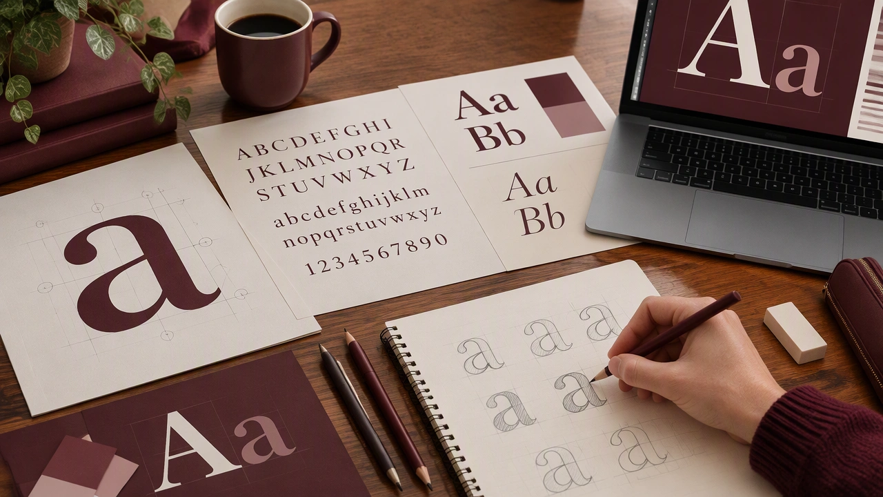
Typography Basics for Beginners: Anatomy, Pairing, and Hierarchy
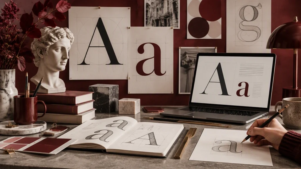
Typography is the craft of arranging type so that language feels clear, comfortable, and intentional. You encounter it every day: on street signs, cereal boxes, recipe cards, phone screens, and handwritten notes. This introduction to typography basics for beginners with examples treats type as a practical design skill you can learn by looking closely. Once you know a few names and principles, you can make better choices in posters, presentations, websites, menus, and everyday documents.
Start with the anatomy of a letter
You do not need to memorize every technical term, but a small vocabulary helps you describe what you see. Letters are built from strokes, shapes, and spaces, and those details create much of a typeface’s personality.
The parts you will notice first
- Stem: the main vertical or diagonal stroke, such as the upright line in a lowercase l or the thick diagonal in a v.
- Bowl: the enclosed, rounded shape in letters such as b, d, p, and q.
- Ascender: the part of a lowercase letter that rises above the x-height, as in b, d, and h.
- Descender: the part that drops below the baseline, as in g, j, p, and y.
- Counter: the enclosed or partly enclosed space inside a letter. A closed counter appears in o; an open one appears in c.
- Aperture: the opening that leads into a counter. Wide apertures, as in c or e, often feel open and highly legible.
Look at a familiar street sign. The letterforms are usually sturdy, open, and evenly spaced so drivers can read them quickly at a distance. Now compare that with a delicate script used on an invitation. The script may feel elegant, but its thin strokes and connected forms demand more attention. Neither style is universally better; each fits a different reading situation.
Serif, sans serif, and the space between letters
A serif is a small finishing stroke attached to the end of a larger stroke. Typefaces with these details are called serif typefaces; those without them are sans serif, from the French sans, meaning without. Serif faces often feel traditional or literary, while sans serif faces often feel direct and modern. Those associations are tendencies, not rules, and context still matters.
Three spacing terms are useful here. Tracking is the uniform spacing across a range of letters. Kerning is the adjustment between a specific pair, such as the space where two round or diagonal shapes meet. Leading is the vertical space between lines of text. Poor spacing can make readable letters feel crowded, loose, or disjointed. On a phone, generous leading often helps the eye move smoothly from one line to the next.
Pair typefaces with a clear job in mind
Font pairing becomes easier when you stop searching for a perfect match and start assigning roles. Ask: which typeface will carry the main message, and which will carry the details? A strong pairing usually combines enough contrast to create interest with enough consistency to feel related.
A practical starting point is to pair one expressive display face with one quiet text face. The display face handles a headline, title, or short label. The text face handles paragraphs, captions, and instructions. Because the display face appears in small doses, it can be distinctive without making long reading tiring.
Everyday pairing examples
- Menu: Use a characterful face for the restaurant name and section headings, then a clear sans serif for dish descriptions, prices, and dietary notes.
- Presentation: Give slide titles a firm, compact face and use a highly legible face for body copy, captions, and chart labels.
- Recipe card: Let the recipe title feel warm or decorative, while ingredients and steps stay plain, evenly spaced, and easy to scan with floury hands.
- Personal website: Pair a distinctive heading face with a neutral body face, then repeat the heading face only for major section titles.
Limit yourself to two typefaces at first. If you introduce more, give each one a specific job. A third face can work for captions or data labels, but a growing collection often weakens the system rather than enriching it.
Check compatibility beyond style
Two typefaces can look attractive side by side and still work poorly together. Compare their proportions, x-heights, weights, and overall color, meaning the general lightness or darkness they create on the page. Set the same sentence in both faces and read it aloud. If one feels too small, too wide, or too loose beside the other, adjust size and spacing before abandoning the pair.
Also test real content, including long words, numbers, punctuation, and the symbols you actually need. A headline font may lack a useful arrow, quotation mark, or bold weight. A body face may become awkward when forced into an oversized title. The pairing should survive contact with the material, not just a tidy specimen sheet.
Build hierarchy so readers know where to look
Hierarchy is the visual order you create through size, weight, color, spacing, and placement. It answers three questions at a glance: What is this? What matters most? Where should I go next? Strong hierarchy reduces the effort required to understand a page.
Begin with a simple pattern. Use one clear title, a small number of section headings, and a consistent body style. Make the title noticeably larger than the headings, and make the headings noticeably larger than the body. Do not rely on tiny size changes; readers may miss them entirely.
Use contrast, repetition, and proximity
- Contrast: Create a visible difference between levels. If two styles are almost the same, readers will assume they have the same importance.
- Repetition: Reuse the same heading styles, bullet treatments, and spacing rules throughout the piece so the system feels dependable.
- Proximity: Keep related items close together and add more space between unrelated groups. White space is an active part of the hierarchy.
Consider a bus timetable. The destination column should be easier to find than the fine print about ticket conditions. Large headings identify routes, medium labels mark departure and arrival columns, and smaller text handles notes. The information can be dense without becoming confusing because spacing and type scale reveal the structure.
Read the page from a distance
Step back from the screen or hold the printed piece across the room. The main message should still be visible, and the structure should remain recognizable. Squint until the words blur; you should still see distinct blocks for title, sections, and supporting details. If everything collapses into one gray field, increase contrast and spacing.
Practice with objects around you
Choose three everyday items: a product label, a public notice, and a screen interface. Identify one example of anatomy, one pairing decision, and one hierarchy device in each. Rewrite a crowded label using two typefaces and three clear text levels. Then simplify a form or recipe so that headings, instructions, and notes are instantly distinguishable.
Good typography rarely calls attention to itself. It makes reading feel natural, guides the eye with restraint, and gives each word an appropriate place. Learn the vocabulary, make deliberate comparisons, and test your decisions with real text. With steady observation and a little practice, type stops being an intimidating design subject and becomes a useful tool for organizing everyday communication.